
Trying to get more app downloads in the app store by creating a long-lasting first impression? Your app icon is the first impression of your app. App icon can make your app instantly recognized or blatantly overlooked.Custom icon design can help you create a memorable first impression.
You can take the help of icon (logo)designers, icon design companies, or best Mobile apps design company USA who can also help you in designing app icon along with the app development. Or if you want to create icon by your own, you should think about some considerations which I’ve explained below.
How to design a perfect app icon?
An interactive and eye-catchy app icon design can do a magic in attracting users attention, as the name and icon of the app is the first thing users interact with, not the content or the features of the app.
Following are some tips to design an eye-catching app icon-
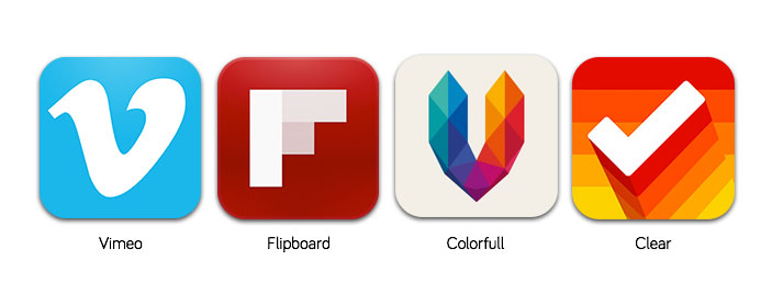
1. Use a unique shape and symbol which defines the app
An icon should be expressive enough to tell the visitor what it is about.The user should be able to guess instantly about the app’s core functionality when he sees the icon.The best way to create such icon is to use unique shapes and symbols that define the app.
2. Keep it simple
Avoid putting more colors or images into a small icon. Even though your app is having more colors and features, your icon should stick to 2 colors or only one, on the other hand, don’t express many features in a tiny icon.
3. Don’t include words
In a tiny icon, it’s difficult to read long words.So you should go for a single letter that may be the starting letter of your company name, app name or the core product name.
4. Use striking colors
Using striking colors can power your app icon to stand out among other app icons as well as it can look attractive. Also think about the features and functionalities of the app while choosing color. Blue is the widely used color across the world, so that can be option for you. Check your icon by using different colors and background to get the clear idea about which looks more attractive.
5. Be unique and creative
Your app should stand out from the crowd, so it should be more attractive.You should build simple concepts by having exceptionally unique and creative thoughts. The intricate deliverables are often built on simple and intuitive shape compositions.
Conclusion
The app icon always plays a crucial role in attracting the users. The attractive and pleasant app icon results in getting more downloads to your app.You should research to understand what type of icon will work best for you, and by keeping above points in mind you can create a beautiful app icon.


/image%2F1972806%2F20161018%2Fob_dd04b4_name-your-app.png)
/image%2F1972806%2F20161017%2Fob_bc52f8_mobile-app-promotion.png)
/image%2F1972806%2F20161017%2Fob_17bb66_mobile-app-development.png)
/http%3A%2F%2F3.bp.blogspot.com%2F-SCcgFbhpH4c%2FV8lJ0XQEICI%2FAAAAAAAAAHE%2F0S8Td2rcqAoxVIopXj2Qcc1Nluh3PXdhQCLcB%2Fs320%2FUber%2BAutonomous%2BVehicle.jpg)